Thursday 18 December 2014

Photographers Vision - An Insight (without the bullshit)

For years I've been consuming information on photography via written works, seminars, video tutorials and the like. Something that many of them talk about is photographers vision or "your vision". They often delve into how each photographer should develop a unique vision and stick with it. Your trade mark if you like - your style of image making. I've always thought this was bullshit, but today thanks to a comment from a non photographer friend +Chris Dangerfield I think I finally understand. I understand that those people writing about vision could not make me understand because they didn't understand. They thought they should. They thought they should write or talk about it because everyone else does. It's always in the photography course and in every handbook you'll find.

Thanks to Chris I finally understand it and I'm going to have my crack at writing it down to see if I can help you understand too. It's bloody simple. So simple most of us are blinded by the light. Let me lead into the discussion by quoting Chris where he commented on an article link I posted about Street Photography.

I enjoyed this, but one thing I keep observing regarding all you photographers, both here on G+ and those I've met in the flesh is a constant eye that catches images that I often walk right past. It's seeing something that I mostly don't. Some composition, juxtaposition or odd combination that fascinates and isn't 'lost' because you guys snagged it.

I don't mind that I don't (mostly) catch them, but I'm grateful you guys do and then share them with your POV.

I know a film director who's like this about character moments on the streets. We can walk the streets of New York (or any city) and he'll point out fascinating things, scenes and characters all around us that I might walk right past, as I'm in my own head.

Now, I'm constantly thinking of stories. Images often cause completely unrelated stories to unfurl in my mind and I can get facinated and absorbed in them, but it's a very different thing than 'seeing' the image that is actually there.

So, I'd add that to his lists of 'needed things'. However, maybe that just goes without saying.
:-)

That thing so many of you have that makes you notice the image and capture it for the rest of us. I'm very grateful you do it... in a studio or as a 'tog out on the street. Thanks.

Chris has a fascinating mind and he sees stories everywhere he goes in much the same way I see images. He sees stories in my images that I never did. So where does this leave us on photographers vision? Well, for me, it basically simply means that as my photography has progressed and as I've come to admit that I'm an artist (this is hard for a concrete science person) what I see around me has changed. I see colours; forms; textures; light. Not just light, but how the light is falling, where its coming from, how it is affecting a scene and I think about how it would appear in an image. I often see a composed image simply appear in my mind when I look at a scene. Either I'm crazy or I'm a photographer and this is my vision. Ok it could well be both.


There, see, simple. Your photographic vision is how you see the world. This reinforces my belief that it's not possible to have or develop a single vision because it occurs and changes based on what is around you, what is influencing you, who you love and who loves you. How the people around you make you think and feel. It's how your arty brain thinks and sees and from time to time smacks your science brain in the forehead with a claw hammer and asks did you see that?

As you progress from technical shooter mastering your skills and your machine(s) of choice your mind is quietly mastering the craft and vision of what you do to make an image. Note I say make not take - I'm in the Ansell Adams camp on that one. Don't know Ansell? look him up - most people see the monochrome magic images of Yosemite when they think of his work but there is oh such much more so go ahead and hunt out his work - especially his videos where he discusses how pretentious some photographers are.

Sunday 2 November 2014

Testing the Tamron SP 150-600mm F/5-6.3 Di VC USD A011

This morning I was fortunate in that I was loaned a Tamron SP 150-600mm F/5-6.3 Di VC for a couple of hours. The lens is well made and feels very good in the hands. I won't go over it's technical specs as they're all on Tamron's website. Before we get into this I'm not a professional lens tester. If you want that then go over to DP Review. If you want the impressions of a serious amateur shooter then read on.

This is a full on lens, it's key features are that it is a zoom with 150 out to 600mm which is quite staggering on the full frame body I use. It is f/5 at 150 and runs out to f/6.3 at 600mm. What does this mean? Basically the lens gets a bit darker as you zoom out meaning your depth of field will change during zoom. For my uses this isn't a big deal and I spent nearly the entire time today at 600 shooting fruit bats and birds by the Yarra River at Bell Bird Picnic Area (look for Bell Bird Park Kew if you're using Google Maps).


The lens resembles a bazooka when fitted with it's hood and extended to the 600mm zoom range. It's not a heavy beast so the SLIK head coped with it's weight easily. It's pretty well balanced where the foot mounts to the lens.

First up I wanted to see how sharp the lens was when hand held at the full 600mm, which is a great test of the VC (Tamron's image stabilisation). The image below is a clump of grass on a river bank which is about 10m below and 20m vertically from where I was standing. It was quite windy near the river and this grass was moving quite a bit. At 1/1000th this is impressively sharp for hand held. My general focal length times 2 guideline would want this lens at 1/1200th at 600mm so I'm very pleased at it's performance at this speed. This shows that the VC is pretty damn good. Being able to hand hold a 600mm is pretty cool as it is. Nice smooth bokeh and an impressively shallow depth of field at f/6.3. I've got a 400mm that I cannot hand hold so to be able to do it on a 600 is amazing.


Next up, I wanted to look at chromatic aberration. A lot of large range zoom lens are pretty awful but I'm pleased to say I had to pixel peep before it became obvious with this lens. This is a clump of leaves poorly lit on a cloudy day with the brown background of the Yarra River.


At 1:1 I I was just starting to see some touches along the edges but quite unnoticeable unless you really go looking.


I had to go to stupid lengths and pixel peep to really find the evidence, finally I could see it plainly but really, who zooms in this far to see individual pixels. I can see a lot more in the way of sensor noise than I can in the leaves.


So onto the subjects of the moment, the whole point of such a large zoom is nature photography. On this day I was chasing fruit bats along the river where they roost. The well lit shot has amazing sharpness, something I'm not accustomed to in such a large range zoom. I have to see that to my eyes it's as good as I experience with my L series lenses. The colours and light are faithfully captured. The bokeh even at f/6.3 is smooth and graduated even though some of the branches in the background are physically close to the bats.


So how does it do with more colourful subjects? Fortunately there was a curious Lorikeet hanging around over head watching what I was doing. Finally the sun came out and I got to shoot the Lorikeet around 10m above my head (looking for an opportunity to crap in my beard no doubt). Shooting nearly straight up into the bright sky the lens did an awesome job of capturing the colour of the moment. I have brightened the shadows a touch reduced the highlights and tweaked the clarity. I'm very happy with the outcome of this shot.


The final question in my mind having been wowed by the other outcomes was, how well can it track movement and maintain focus on the continuous fast moving object? Can it keep up with a fast flying fruit bat? In the situation I was in today the verdict is nearly, although I have to say I've had the same lack of success with Canon's native lenses in this location so it's not just the Tamron it's also the 5Dii. I think in a place where you were tracking the flying object against a clean background that the lens and camera would do a great job of focus tracking and would nail it. In today's situation where there are trees across the river the camera struggled to keep focus on the very fast moving bats. To me this image is acceptable, to a bat watcher it might not be. The body is in focus but the face is just a little bit out.


For a last image, one thing I found very cool about this lens was it's emulation of a good old fashioned brass barrel lens for the out of focus areas, in a busy area like the tree below with the Lorikeet I love what happened to the out of focus elements.


So in conclusion, would I race out and buy one of these? Well, yes frankly. At $1200 to $1300 depending on your preferred lens source it's well worth the money. There is no equivalent in Canon's range let alone in that price tag. For the money you're getting a really stunning piece of glass. I suspect I may just have to flog off some of my excess gear so I can have one.

I can see myself using glass like this for motor racing  as I usually head to the Philip Island Moto GP and World Superbike Championships and this would be able to be carried on the bike as put away it's very manageable for bag miserly people like me. Events such as fun runs (e.g. The Colour Run - you can get the shot without getting covered in camera destroying powder) and major fitness events like Tuff Mudder.

On my coastal crawls I wouldn't be surprised to find myself hunting for shots of seals dolphins and whales from shore and perhaps the occasional surfer. When those awesome lunar events such as eclipse, harvest and blood moons come up this is the lens for the moment. Being a fairly light weight I carried it comfortably off the tripod for around an hour without support.

To be clear Tamron have not paid me to write this nor am I getting a freebie. I'm just impressed with the lens. Good going Tamron.

There is some bad news if you shoot with a Nikon, sadlywhile there is a Nikon version of this lens its very hard to get. This is a shame because while I shoot with Canon I've spent time with Nikon bodies and they're great kit, some things such as the lightness of their mirror and shutter mechanism even in the big full frame bodies means less movement during shooting and this lightness is wonderful compared to the clunk of the Canon throwing around a mechanism the weight of a Mini Cooper inside its body.

If you were shooting with the Sony A7 you could use the EF adaptor and mount this lens but the balance might be a bit off as the heavy DSLR would be giving some of that neutral balance around the mount point.

Tuesday 26 August 2014

Less is More

Over the last three decades my interest in photography has increased dramatically. I started in film. I developed my own and made my own prints.

At that time I probably made around 1,000 negatives per year. Today in the wonderful world of digital I make around 25,000 images per year.

I've come to the conclusion that this is too many. This conclusion has come to me over time. Originally I just though that photography doesn't have a cost barrier any more is commonly available and per image is very cheap.

This is true until you consider retaining and effectively backing up all of those images. I'm just about to hit four terabytes which for an amateur photographer is quite staggering. My current backup system is based on RAID arrays and portable drives. All of which are 4TB in size. You can't actually buy drives that are bigger than 4TB so I will have to change the way I work. It's begun to dawn on me that storage isn't actually as cheap as it looks when you've got a lot of it. As cataloguing, rating, processing and releasing images in such quantities is a lot of work. My time on this world is not infinite so I'd like to spend more of it creating better images.

Rating

I rate (most) of my images from 0 stars to 5 stars where the following axiom is true:

☼ bad, really bad - there is something technically or compositionally wrong
☼☼ tolerable - the image is ok and might be a rescue candidate with post processing
☼☼☼ ok (this is the first level I'll show other people)
☼☼☼☼ good - this is the first level where I feel proud of an image
☼☼☼☼☼ amazing - these are images I look at and think "did I do that? really?"

Five years ago when I first started to rate my images I found that 80% of my images fell into three stars with less than 1% falling into four stars or better and the rest down the bad end of the spectrum.

These days I get around 15% of my images falling into four stars or better and less than 5% fall into the bad end. While this is better this is still a very high percentage in the middle of the road "ok" mark. I want better than this. I want 50% of my images to be four stars or better.

Now sometimes you simply have to shoot a lot of images, I love to shoot plays for example and to get 50 images I'm proud to share back to the play company and actors I'll shoot 500 images to make sure. These are done in a very difficult environment with bad low light and a lot of movement. The enemies of the photographer. This isn't likely to change.

When I've been out shooting because I want to, or am out on a photo walk with like minded people and friends I would have shot around 400 images per day and had my usual level of keepers. Now I'm making two changes, the first is around the overall number of images and the second is around the quality. I want to reduce the number of images I make and improve the quality dramatically.


Vision

To this end I started to consume books and forums on composition, exposure, seeing and creating a vision for myself. I've consumed so much information that I've decided that any photographer that claims to have sight or vision is full of shit. I do realise that I've come to see the world differently, I see light, I see colour, I see faces in great detail, I stare into stranger's eyes (freaking them out) because I'm thinking about how to photograph their face. If you call this vision then fine, it's vision and I've got it. I subscribe to the old adage that developing a single thematic vision is actually worthwhile or even real.  I've also decided that only one person is important, me. While I love the feedback from my peers and viewers of my art, I don't need it to survive. I want yo be happier with my work myself.


Where to from here? How to make the leap?

I actually think that in words, this is quite easy. In practice it's going to be a struggle but it is a struggle I intend to win. I want to meet my self imposed goals.

Firstly, I intend to be more deliberate about making an image, I intend to inspect the object I'm interested in to find the best light in the moment, the best angle, the best composition. To this end I've set myself a target, I will only produce a maximum of 36 images per outing. I'll measure how well this is working for me over time, maybe it's a stupid idea, maybe it will work. There are all those smug bastards on the internet and in the traditional club forums who always mutter quality not quantity when you are peer reviewing images. Maybe they're right. I doubt 36 is the number I'll settle on forever, but I picked it because it resonates for me because of my background in film.

My next step is to complete the job of convincing myself every image is expensive and worth taking some time. I want to step away from the documentary photographer who is the casual artist and enter the world of the artist who is the occasional documentary photographer.


Tips for myself - Photo walks


  1. Every image is worth spending the time if it is worth capturing.
  2. I will set a theme or small set of themes when on photo walks to limit the sources of images.
  3. I will explore each object or person (where possible without offending) before photographing them to decide how best to light, measure and angle the shot for a boost in compositional quality and to try to eliminate the shit.

Tips for myself - People shoots

This one is going to be harder. I'm not good at directing people and I'm on the beginning path to recognising what looks good for the person I'm shooting. The basics are easy enough, no-one especially females want to look fat so avoiding the double chin and fat arm syndrome (poor angle) is imperative but there are much more subtle things to look out for. I don't mean things like a lamppost growing out of someone's head - I'm well past that stage.

I think I need to try and visualise the image in my mind possibly by using wanky hand framing if necessary or even a cardboard cut out frame. This way I'll make and dismiss the crap images before they happen. Maybe I'll look through the view finder and simply resist the button. Who knows, I'll find something that works.

People shoots will need more than the "36" because I recognise my failings. I'll set my limit initially to 100 and look to reduce this considerably over time as I improve my outlook.


Is this artificial scheme going to work?

I could be kidding myself, it's likely I am. I know for example that the best professional photographers can sometimes shoot upwards of 2,000 frames on a person shoot. They then turn these over to their assistants for culling and will themselves work with 100 or so images with the client to decide which to post process and use for the final brief. I want to start with that 100 - am I being incredibly arrogant to say I can do this when they can't? I don't think so for a couple of reasons: Firstly I do not have the pressure of making a living from photography, Secondly I can afford to take my time. I certainly owe it to my model to produce something which is pleasing for them, but I feel my pleasure is more important. This means if I get no images I'm ok with that. I'll always make sure I shoot with at least one other person to ensure that the model does get images on a time for images gig.


The "36" - where will you shoot yours?

To help launch the idea for myself and to coax others into having a go I made a photowalk called The "36". This received quite a bit of favourable comment but lots of people saying they were not in Melbourne, so I changed it to be The "36" - where will you shoot yours?

This has opened the concept up to anyone in the world to have a go and share their results. It's partly in homage to film, but partly to set a starting point for my own goal. It's a bit like a diet - there is always tomorrow to make the change. August 31st 2014 is my tomorrow and for those of you coming along on Sunday for the journey I hope we have a wonderful afternoon of photography with food and drinks afterwards.  Maybe this will become an annual event, we'll see. I hope you come along and have a fun time and I look forward to your "36".

Update

I've found that aiming to shoot less really has worked for me and has improved my images. It has also given me less images to go through from each shoot and reduced my post processing work. I've become more deliberate. 

I did find that I encountered a danger of hesitation, to counter this I am using two cameras, the full frame DSLR when I'm being deliberate and a smaller mirrorless micro four thirds machine for when I'm more inclined to play.

No, I'm not limiting myself to 36 every time I go out, in fact I don't. Now I come away from a photowalk with a couple of hundred images instead of the thousand I once did. From a model shoot I'm down to around 400 images for the day's shooting.

I'm quite enjoying this new flavour. I'll be keeping it up at least until it's time to try something else to keep alive the simple joy of making images.

Sunday 17 August 2014

Why you need insurance for your camera... or "clunk clunk clunk smash"

Yesterday while shooting with friends on a private theme shoot for "Gluttony" I dropped my L 100mm macro. It's quite dead with the internals having come adrift from the inside. While this is a horrible experience and is going to cost me money, it did not ruin the day for me because the lens is insured. This meant I could brush off the loss and continue shooting with my friends instead of curling up in the corner like a monkey in a small cage.

Because I'm not a professional it's covered under my house contents insurance. I've got an IBNA gold level policy which covers me for theft, accidental damage, electrical and mechanical failure. It will still cost me money to make the claim because I've got a $400 excess on the policy. So replacing this lens will cost me $400 instead of $1500. This is fair because it stops me making frivolous claims.

This insurer also purchases through an Australian brick and mortar store so I know I will get a Australian marketed version of the lens which always makes warranty support from Canon more plausible should the need arise.

If you don't already have coverage for your gear built into your contents policy, you should consider it. By the way, if you're in Australia check on your policy as you may find you're already covered for some of the above. Electrical and mechanical normally have to be added to the policy and often you need to add "transit" which covers you when your gear is not inside your house (which I did my moving to a gold level).

Note that if you are considered professional by the insurer you'll need to buy separate insurance as your house content policy probably only covers amateurs. It's worth finding out what your insurer considers to be "professional" too as they'll each have their own standards.

Sunday 1 June 2014

Understanding the histogram

This applies both to the histogram that your camera probably can display and to the histogram in your favourite image processing tool - in my case Lightroom.

First up, the camera, mine is capable of displaying one of two histograms, one of them shows the overall light in the image and the other shows the same thing but in the three colour channels in which the device operates, red, green and blue.

Lightroom's histogram shows the colour spaces as well as highlight and shadow. A couple of people on g+ asked me to write this tutorial, I've agreed to do it on the basis that it will help me to further understand the histogram. To ensure I have complete understanding I've referenced the manual for Lightroom 5. I'm not going to go into huge detail because I don't want to overwhealm the new histogram user, if you need more information the reference manual is available from adobe for free download.


First up, lets look at the histogram, it's a fairly simple device to people familiar with graphs. On camera the histogram is generally read only and will look somewhat similar depending on your device.

Let me borrow some text from the LR manual to describe the histogram because I think they did it so well "A histogram is a representation of the number of pixels in a photo at each luminance percentage. A histogram that stretches from the left side of the panel to the right side indicates a photo that takes full advantage of the tonal scale. A histogram that doesn’t use the full tonal range can result in a dull image that lacks contrast. A histogram with spikes at either end indicates a photo with shadow or highlight clipping. Clipping can result in the loss of image detail."

Ok, first lets talk overall about what you're seeing

How do cameras see colour? Before we get into the histogram, there is an important concept we need to first talk about. Your camera does not see colour the way you do, for each sensor element (or pixel if you prefer although that's not strictly true but good enough for this purpose) there are three sensors, one measures the amount of red light, another green light and another blue light. The three measurements together can be used to make up any colour within the gamut of the device to recognise, encode and store. Cameras see colour in eight bits (and ONLY eight bits) per colour, this means each of the three colours Red Green and Blue (RGB) can store values between 0 and 255. 0 means that there is no colour of that part of the spectrum at that location of the image and 255 means that there is an overwhelming amount of that colour.

Much like mixing paint colours the RGB measurements are mixed to produce the image you look at through computer logic. The RGB values are stored within a RAW file. Encoded RGB values with clever compression techniques are also stored in JPEG, PNG and other formats.

You've probably seen bits described elsewhere in the imaging detail of your camera of eight, ten, twelve, fourteen and sometimes as high as sixteen. This bit number does not change the eight bit nature of RGB but it does change the width of the histogram - the tonal range that the device can capture and understand.


The best analogy I can think of is a picket fence. A picket fence which has a gap between each picket might be considered eight bit tonal range. A higher resolution picket fence would have a smaller gap and a so on until you reach a fence that is solid with no gaps between the pickets that defines a perfect utopia of sensor technology that we are a long way from today.

Clipping Warnings: there are two arrows on the top left and top right of the histogram. They represent the clipping warning controls and they are on off switches or buttons. The default to on. Clicking on one with your pointer turns them on and off. The left hand side governs warnings about loss of detail in shadows and the one on the right governs warnings about loss of detail in highlights.

Black Clipping: this warning will show as bright blue dots or shaded areas of your image. It is a warning letting you know that at current histogram levels too much of the image is totally black (RGB values of 0, 0, 0). This will also show as a peak in the left column of the histogram visual display.

In this image the warning is coming in part of a grape vine in shadow.

White Clipping: We often see this in the sky of images or around other bright sources of light, it means that you've lost detail because there has been too much light for sensor to record effectively in this area. This shows up as bright red dots or shaded areas of your image.

This warning is coming in sky that is simply too bright where the exposure has been for the landscape ignoring the sky.

I might note these clipping errors and the limited tonal range of camera sensors is the reason behind the somewhat laborious techniques of increasing the tonal range including blending multiple exposures, tonal mapping of single or multiple images and high dynamic range (HDR) techniques.

What does the graph mean?

Well to understand that we need to delve back into the colours, the graph is a sampling across your image and again to quote the LR manual is "representation of the number of pixels in a photo at each luminance percentage". So what does that mean to you as the photographer? Well it means that LR has sampled the image and worked out based on the space it has to show you the histogram how many pixels there are of each of the available horizontal points on the graph. Simple huh? No... ok as each colour in each of the spots gets brighter the graph will be higher. Where there is no light it will flat line along the bottom. Where there is too much light it will flat line across the top.

The graph shows in the three colours red, green and blue with a shaded area for each. Where the colours overlap the graph changes. Grey means that all RGB overlap at that position, yellow appears when red and green overlap, magenta where red and blue overlap and finally cyan when green and blue overlap.

Within Lightroom in Develop mode (as of version 4 and continued into version 5) the histogram is divided into areas representing blacks, shadows, exposure and highlights and whites.

Each section shows the corresponding area affected by the exposure sliders in the panel below. Each of them affects overall the height of the graph, or more correctly a percentage range of the pixels.

You can adjust the amount of pixels that fall into each area using either the sliders or by dragging the boundaries of the five histogram areas to expand the tonal range attributed to that area of the light.

So what do I do with it?

Well, now that is a good question, we now know that for a standard image it is desired to have all of the graph from left to right to peak as high vertically as possible. However, this is for a standard image. If you lived in Kodak world of some time back this would be a bright sunny day with an image shot around f/11 of a beautiful landscape with every colour in the rainbow present and accounted for in all the possible shades. The brainiacs of workshops and courses will often tell you it must cover the whole tonal range. I really don't think so. First up, compare the graph with the image itself. You can see that the majority of the exposure is off to the left of the image meaning there is loads of detail in the blacks, shadows, midtones, but that the highlights and whites are lacking. This is quite normal because this is an image that is predominantly grey. So there should not be a lot of highlights and whites.

Most of us probably shoot in other conditions including artificial light and we shoot images of widely varying subjects. The image from the graph used in the five areas above is a an example of an acceptable image, not an exiting image, but acceptable and would I change the histogram - not in this case, but we will explore what happens when we do.

First up, lets drag the histogram over to the right by pulling the right boundary of the section labelled Exposure to the right of the image.
This has resulted in a significantly brighter image, it's certainly less dull than the image above, however, as a documentary image it is now lacking because it's harder to read the inscriptions.

Where this modification would come into its own is if we were planning on  doing further conversion of the image to monochrome or indeed if printing it. The first image would have been quite unacceptable printed but the second would be better.

Should I do this to all of my images?

Of course you should. Well, no, ok you shouldn't. I'm going to run through a bunch of example image that I find acceptable and show you their histogram. As you can see the histogram varies wildly from image to image. The first rule of thumb is look at the image. It should be evident to you if it needs to be darker or lighter in general to match your memory of the subject.

Ok in this image, the histogram is telling us we've got a lot of blue in the highlights and that there is a mix of red and green in the mid tones of the exposure and there is a modicum of colour in the shadows and blacks.

This is an acceptable histogram. There is no clipping. This is a well exposed image for the subject matter.

When I first encountered this image, there was some clipping within the blacks so I did drag that area slightly to the right into the shadows which cured the clipping and improved the image contrast in these areas.


In this image which is mostly a green subject, not surprisingly there is a lot of green. There is a minor clipping warning on the green channel shown on the right hand side and one in the magenta channel on the left.

I haven't altered this image from the exposure I captured because I don't think it needs it despite the slight clipping.


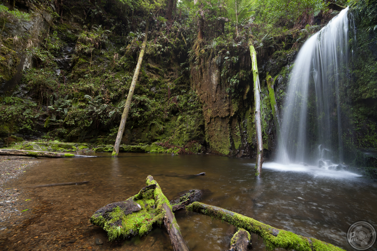
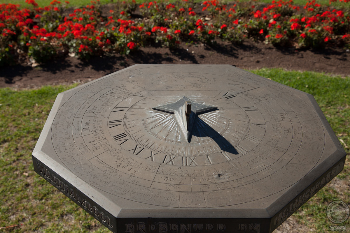
This church in Warrnambool exposed by tungsten street lighting really does need some attention. We can see from the histogram there there is very little representation of colour except in the blue channel (sky is blue, even in the dark!). There is major clipping in the blacks and a lot of areas with highlight and white clipping. 

These warnings give us the starting point to fix this image, but before I did that, I'd fix the white balance and straighten and crop the image. This way we'd be working on the histogram only for the image parts we want to keep.

There is no doubt in my mind the best place to fix histogram issues is in camera, that's why you camera can display it. In this image I've got a model looking at an atlas face down on a carpet of leaf matter from the sequoia grove that she's in near Warburton. The image is obviously underexposed. Sam is illuminated by some small LED flood lights and a gold reflector. I was trying to hand hold so could not do a lot about the exposure without losing depth of field as my shutter speed was already down around where I'm comfortable hand holding. The only way to go further would have been to use the tripod but then Sam might move. In the end I compromise. There is an enormous amount of detail in the shadow areas as displayed in the histogram and some detail in the mid tones but there is near nothing in the highlights and whites.

To attempt to remedy the image, I dragged the histogram shadows into the mid tones and dragged the mid tones into the highlights.

This has had a brightening and positive effect on Sam herself but in the background it has made an enormous amount of noise visible that would be need to be tidied up through softening.

The lesson here - don't always work just on the histogram, I'd be better off using local adjustments to adjust Sam and the atlas only bringing them up and leaving the shadows dark. Afterall Sam is the subject not the shadows behind her.

So, as a general rule, forget the general rule and adjust in ways that suit the image and more importantly your vision of what you want the image to be.

A lazy man's guide to processing images of people in Lightroom with my top 10 simple tips

Ok, so you've got your collection into Lightroom. Well done, congratulations you've taken a big step to managing your collection as a whole. In this article, I'm going to walk you through my LR process which is about both managing the catalogue and applying simple post processing to enhance my images where they need it. In this particular example, I'm going to use an image of Sam shot in less than optimum light on a grey misty day on the outskirts of a forest late in the winter afternoon. This particular session is centred around processing an image of a person.

First up, you really don't need any special tools apart from LR itself. There are plenty of them and I've tried many. You've got to be really careful with the tools that "fix" faces, they often leave your subject looking like a barbie doll. Your subject isn't going to want to see that spot that appeared during the shoot but neither is she going to want to look like a plastic doll. Go easy.

The rest of this guide is for people like me who have some idea of what they want to do, but the plethora of controls more complex than the pilots console in a 747 befuddle you...


Ratings as a method of catalogue management

First up, I've got a bunch of similar images here, to minimise both my work in post processing but also to avoid over sharing on social networking I want to come down to one or two of this set to look at further. So to work out which one I'm going to concentrate on I'm going to review each of the similar images and rate it from 1 to 5 where 1 is worst and 5 is best. This is probably my number 1 tip in using lightroom or any catalogue software for that matter.

Tip 1: Using ratings helps you find things later.

Using ratings along with your other meta data you can answer searches such as find me the best images from the shoot with Sam at Warburton in the forest. Your location and model meta data and keywords help with most, but the ratings are the only thing that can help with "best".

How do you rate them? Well it's subjective, but you can introduce some objectivity, I see it as 1 means I really don't like the image, perhaps its got a serious technical fault (e.g. out of focus or too slow a shutter speed making it blurred) and 5 means I really love the image and am completely proud of the outcome. In this case, this is a shoot of a person so I will also consider if I've captured the essence of the person and ensure I've not captured anything that unfairly detracts from her appearance from my own positioning. If I was using flash I would also be looking for things like catchlights in her eyes (a positive) and reflections of equipment (a detraction).

You select the image you want to rate from the filmstrip (quaint name but hey it works) of images that pans horizontally across the screen below the main window and press one of the number keys 1, 2, 3, 4 or 5 to rate the image. This will show up as a grouping of stars.


In this case I've rated the centre image higher that the companions because of a few factors, the composition fills the frame, yet the off centre of the umbrella stops it dominating Sam and it gives the impression of implied nudity which makes the viewer want to see more and search your image with their eyes. As you can see from the other two Sam was very much dressed and her expressions and pose are very similar. There's nothing wrong with the other two so they got three (above average) and the centre image got four.

So lets process the image

The lighting of the day wasn't very friendly to colour and I remember that Sam isn't pasty, she has lovely skin tones and that umbrella is quite vibrant (like it's owner Fran). So how do we tackle this to bring the images back to what we remember on the day, well sometimes I use colour cards in test images and sometimes I wing it. In this case I'm winging it (mostly because I left my colour cards at home).

First up, we need to change from Library mode which is about managing images to Develop mode which gives us access to the copious controls to modify an image. To do this you can press the d shortcut key (every key does something in LR) or you can click on the word Develop with your pointer. The word Develop will highlight to show the current mode.


Tip 2: Learn at least the basic short cut keys, they will save you loads of time

Now that we're in develop mode, I'm going to change from the default single view of the image I'm working on and minimise the film strip and left hand panel to devote the most room on the screen to the image. I do this by clicking the little arrows around the sides of the screen on the left and bottom sides. They're circled in red below.


Tip 3: Get as much room as possible for your image while working on it

Now your view changes so that your image is centre stage on the screen and considerably bigger than it was before. To get the panels back, just click the arrow again, or hover over it to bring it back temporarily so you can use a feature from that panel then move the pointer away to make it drop away again.

Tip 4: Before and After View helps you to know when to stop processing


The next thing I'm going to do is click on the little box with YY in it which will open the image in a before and after window. I find this very handy to see where I'm going with the image. It helps me know when to stop so I don't over process the image.


Alright, now we're ready to begin. The first thing I noticed with this image is that its quite dull. Fortunately I shoot in raw, so this is easy to fix, you shoot in RAW right? If you don't, then please consider it as it gives you the best opportunity to correct your images in post processing if they need it. Shooting directly into JPEG means that you're often limited in what you can accomplish afterwards.

Tip 5: Always shoot in RAW

Now that we are ready to move forward on this image, I'll make the gross changes first, then finalise with the subtle changes afterwards.

Tip 6: Use the tools that affect the image overall first, then narrow down to the subtle tools

The first thing I'm going to do is set the white balance to Cloudy, sometimes this is all you need for an image shot on a dull day. By the way, did you know that when shooting in RAW on your camera the camera's white balance setting actually means nothing? All it does is affect the preview JPEG embedded in the RAW. You can change it to anything you want afterwards (remember Tip 5?).


The tool to change the white balance is high lighted in yellow and circled in red, simply click on it and choose the value you want from the list. Try all of them, can't hurt in Light room you can always undo everything you've done on a RAW file (remember tip 5?) by selecting from the Settings Menu the option Reset All Settings. A lot of people never use this because in my opinion it's poorly named, to me it doesn't talk about a photo it talks about the software.

Tip 7: You can always undo what you've done in Lightroom so experiment!

The image is already looking a little better, but the change is fairly subtle. Sam's skin tones have become more normal for her skin and her hair and lips have popped a little. There is still more to do. The next thing I'm going to tackle is the clipping in the shadows. I've got clip warnings turned on for shadows and highlights, I think this is the default in LR but if it's not turned on in your copy just click the two little arrows that are top left and top right in the histogram.


While we're here, you can see that the histogram shows that this image is still a little flat, by this I mean the range of peaks is concentrated to the left of centre of the image, this image should be brighter than it is because the highlights are flat lined. I'm going to deal with this a little bit in this image, but not all the way because I actually want the darker look for this one.

Tip 8: The histogram opens a window into the image exposure and allows you to adjust it for the result you want to achieve

To deal with the clipping I'm going to bring up the shadows, until most of the bright blue warning dots vanish, in this case up to +43. I do this by grabbing the slider and dragging it to the right


Not only are the blue warning dots gone, but Sam herself as come up a bit more too. Not far enough yet, and the colours of the umbrella are still quite boring compared to what they should be. So we'll keep going. Using the same method I'm bringing clarity up +19 and vibrance up +57 which is a lot, but with this image it works out nicely - how do I know when to stop, while sliding slowly I watch Sam's face skin tones - after all I'm trying to rescue the umbrella but she is the important part of the image, so it needs to be right for her.

Tip 9: Watch the most important part of the image while adjusting and make that part right

We still aren't there yet and we've also made the whites of Sam's eyes blue, we'll fix that later. You'll notice a little bit of the clipping has come back too, but not enough to worry me, there is still plenty of detail in the shadows.


Next up, I've played with the Hue | Saturation | Luminance panel, in this case particularly the hue. These sliders work just like the others we've touched and in this case change the nature of the colour in the image. There isn't really much science to the way I use this panel, I really do just play until I like it. I do have some knowledge of colour that I've built up over time and by experimentation (tip 7!) have learned what effects the sliders have. 


Ok, I'm nearly happy with this image now, but remember those blue eye areas that should be white, we're going to fix them next.

First up, I'm going to zoom into the area of Sam's eyes and work on them using the zoom tool. This is the default pointer tool in Develop mode when there are no other tools selected. Just click the pointer where you want the zoom to be centred.


You can see the blue eyes quite clearly in this image, there are a lot of ways to deal with this including reducing blue overall in the image but I want to keep the same blue that is in the umbrella. I'm going to cheat a little bit and I'm going to use the local adjustment brush and paint in some desaturation - not because it's the best way, but because it's the quickest way I know of to achieve what I want to do. 

Tip 10: The local adjustment brush helps you make changes to small areas of an image without affecting anything else.

The local adjustment brush tool is the small paint brush with a halo of dots and is highlighted in this image. It's used to change small (or large if you're patient) areas of the image without affecting it overall.

In this case I'm going to reduce the saturation, so I'm preselecting that using it's slider in the panel below the brush that opened up when I clicked my pointer on the brush.

This will allow me to paint in the change of less colour into the areas that I want in the image.

In the close zoom I can also tell I've pushed the magenta up too much, but I'll deal with that after I've done her eyes.

Now that I've selected what I want, I simply paint over the areas I want to change (you might need to select a small brush - I always have it small).

By painting over the areas of Sam's eyes that were blue I've made them white again in a simple way. I haven't changed the rest of the image. Now to deal with that over blown magenta. I'll keep the image zoomed in and go back to the HSL tool and simply slide that magenta slider back a little to the left until it looks right. To do this I have to close the adjustment brush, I do this by just clicking my pointer on it again.

I've brought the magenta slider back down to +33 and I'm now quite happy with the image overall as it feels like nice skin tones in the way I remember Sam to be. The previous steps I've done have highlighted one aspect of Sam that I imagine she would rather not be there, there are a couple of spots on her forehead that have become more visible so I'll make them go away.

Bonus Tip: You can easily remove small marks out of your image, be they sensor spots or be they skin spots of some kind using the spot removal tool.

First up, use the zoom tool to zoom in and centre the image to the place you want to work on, then click on the spot removal tool to open it's palette up.

Click the highlighted tool with your pointer and set the size to be only just bigger than the feature you want to remove then click on the spot and magic it will vanish, you can adjust the source point for the image copy if you need to by moving it with your pointer. This tool uses a content aware fill of sorts which is fantastic for small areas. For larger areas I'd still do it in Photoshop even though you could use this tool for it. It's finicky and in PS it's easy so guess what inner lazy man wins.


Now we've got the final image that I'm happy with. There are some other areas that I could change, but in the size I publish on social media lazy man wins again. If I was making a large print of this image I would also deal with the blue tones I introduced by forcing the blues up earlier near Sam's eyes but on the screen you only see it because I just told you about it. You couldn't see it before could you?


One last thing I do when I export an image that I'm happy with is mark it as a "pick" by pressing the p key either in Develop mode or by highlighting the image in the filmstrip and doing it. This places a flag on the image to help you find the ones you've edited later. I also set the caption in the meta data of the image so that social networks such as Google+ will pick up the text and automatically use it for the photo caption when you upload it.

Now let me show you why I use flags and ratings... It's very simple really... let's say a couple of years from now Sam contacts me and says, remember those shots we did in the forest, I really liked that one of me with the umbrella, can you send it to me. Well, that's not a hell of a lot of information to find an image when you make on average 50,000 of them each year... well, meta data is the answer. I go to the catalogue and I select to search by pressing ctrl-f for find in Library mode. Then I set my search criteria...

I set the keyword to Sam and the attributes to flagged and rated > 4 stars. Guess what, that 50,000 images just turned into three in a few seconds and there it is. I can also see by the search outcome that I did a better job on changing the first image than the one I used for this tutorial. I could go back and fix all the steps here, but guess what lazy man wins again. I have fixed the image itself and you'll see Sam in her glory above.


Extra Bonus Tip: Your complete image history is available for you to show what changes you've made.

If you're doing a photography course or undertaking VCE Studio Arts (or HSC Studio Arts in other parts of Australia - we Victorians love being different for no reason) you can use the content of this panel with your submission to show the experimentation and final changes you made in the order that you made them. You can also remove individual changes but that's a bit out of scope for this session!

This tool shows not only the changes that you have made using individual controls, but also breaks down the changes made by the clustered controls that affect a lot of other parts of the image such as changing the white balance to Cloudy changed all sorts of things. This will help you understand what those clustered tools actually do.
Last of all, happy learning and I hope this brief tutorial has been useful for you.

Tuesday 22 April 2014

Great Ocean Rd, Another Ramble


Day One - Tuesday

Once again I'm on what is known locally as the GOR, the Great Ocean Road which stretches (arguably) from Torquay through to Point Nelson in the states west. Officially it's shorter than that but in reality it keeps going into South Australia for ages.

My goal this trip is to get shots of Wreck Beach that I'm happy with, I've never come away with shots that make me properly pleased with the results.

On Friday morning I'll be on the beach before dawn... but in the mean time I'm camped out at my usual base and trundling around exploring and shooting.


The setting sun highlights the amazing harsh coast line where the Southern Ocean slowly makes Australia smaller. Many ships were wrecked along this forbidding line of tall cliffs. This is shot from the end of one of the many dirt tracks that take the intrepid away from the bus loads of tourists and the city drivers who can't stand the idea of a dirt track. This view shows Lochard Gorge and the 12 Apostles (well about 8.5 of them) in the distance. f/16 1/13th of a second ISO 50 on a 50mm prime.


This is the same location as the previous shot but somewhat later after the sun had gone and with slightly different framing but the same 50mm lens f/16 30 seconds ISO 50. For best results keep your ISO low and expose for the surroundings. This long exposure really captures the might of the ocean as it slowly beats Australia into submission. Even sitting here in my van typing this blog I can hear the waves crashing on the beach over 1km away from me. The Southern Ocean is not to be trifled with. Even in calm weather like today these waves broke half way up the cliff.


Even after dark there are still shots to be had. This is a crop at 1:1 of a very small area of the image showing the sea mists back lit by the sky still slightly glowing from the setting sun. As +Lady Fran W put it this is like a pirate movie. I can see her point, you can almost expect the fulsom figure of the carved wooden maiden adorning the bow sprit of a tall ship to come into view as she rounds the rocks heading in for a secret rendezvous for the purposes of smuggling. 85mm f/16 13 seconds at ISO 125.

On reviewing my shots today I could see the results of coming here so many times. I shot only a few and of those I'm happy with all of them. I'm coming to know this area well and know what I want before I shoot and I've learned over many trips how to get the outcome I'm looking for. On this trip apart from Wreck Beach on Friday morning where sunrise, weather and tides all come together at the right moment I have no plans and will take each day as it comes.

Finishing up these images and this blog entry while I wait for my back up to finish I listen to the rain falling on the roof of my van and think of the other Melbourne photographers camped nearby in their tents. Keep warm folks. It's an early start on Gibsons Steps tomorrow to capture the early morning light on the nearby Apostle and hopefully catching up with a local.

Day Two - Exploring

Naturally visiting the 12 Apostles has to be done sooner or later when visiting the #gor - best seen in the early or late afternoon for the best light minimising the contrast between sky water and rock to allow normal exposures.

12mm fish, 1/160th f/11 ISO 100


The little things matter. While climbing back up Gibson's Steps I noticed this little bush growing on the rocks backlit by the sun. A heavy sea mist in the air made for some nice flaring.

1/600th f/4 85mm ISO 400


While exploring around the timber railway trestle bridge (now rail trail) near Timboon I found this small waterfall on a creek that runs parallel to the former railway. Worth getting the feet a bit wet for this scene.

12mm fish f/11 0.5s ISO 50

Still standing after some TLC from Puffing Billy Railway the railway trestle at Timboon stands proud supporting the rail trail.

12mm fish, 1/30th, f/11 ISO 50

The serenity of the Australian rural scene is often amazing and breathtaking. It's worth pulling over from time to time when you spot something. Everyone fanned out looking for their shot. This one is mine.

12mm fish, 1/125th, f/11 ISO 100

After enjoying a lunch with friends at Timboon we parted company with Kathryn and headed back to our camping at Princetown. It was great to meet another g+ person +Kathryn van Nieuwkerk . In this image are back row - +Paul Pavlinovich +Trace McLean Stef +Peter Sherriff +Kathryn van Nieuwkerk and +Shari Mattox

We had lunch at the distillery and I can't say I recommend it. The service was good. The food was ok but the prices were high for what was essentially pub food. They may aspire to higher foodie paradise but they don't quite make it. Oh and their whiskey? I'll stick with my usual I think. Very expensive ($125 for 500ml) and nothing to write home about.


On the way back the evening light became interesting and we paused several times on our journey to explore and photograph our surroundings. This grass seed silhouette intrigued me. I played around with the landscape in this area but was not happy with the shots. They don't feel quite right. I'll come back to them later.

85mm 1/640th f/11 ISO 100


We headed along part of the Old Ocean Road in Princetown along the Gellibrand River. We found this amazing white bird. I had to push up the ISO to capture his flight in the fading gentle evening light. It's always worth getting off the tourist drag of the main road. There is MUCH more to be seen in this area by simply hitting the dirt.

85mm 1/400th f/5.6 ISO 800


Finally at the end of the day, the sky put on a magnificent show over the flood plains and wetlands alongside the Old Ocean Road in Princetown.

I've seen this area well and truly inundated - the camp ground is on this plain but it's elevated slightly so it's unusual for it to flood but I've seen the road in and much of the grounds wet and sloshy in the past. This usually only happens if the mouth of the Gellibrand gets closed off by a storm.

12mm fish 1/4s f/11 ISO 50


What will tomorrow bring? Well you know that as much as I do. No plans, I'll just jump in the car and go someplace. Something will jump out and magic will happen.

I might explore a bit more around Timboon and the Otway National Park.

Day Three - A few waterfalls and a smashed fishie

Today started like any of my photography trips, up early hunting for images. I found these kangaroos on the hop right outside of the door to where I'm camping.

On the hop in the early morning light in the paddock adjacent the camp ground. There were hundreds of them today. 

400mm 1/250 f/9 iso 2500


In search of mossy rocks and falling water I trekked down to the Elliot River where it runs into the Southern Ocean. Up stream from the mouth reached by good old fashioned bush bashing was a small but magic waterfall. I had to wade through the river to get close enough for the final images of the falls.

12mm fishie 0.5 seconds f/16 iso 50


Onwards and upwards to Mariner Falls. These falls are currently "closed" but the sign said public "should" keep out. Well, that's not a no in my book. That leaves the decision to me and I decided to go. Very well worth the trek and apart from needing to cross the river by wading from time to time an easy walk. The falls are in a natural amphitheatre bowl.

12mm fishie 1 second f/16 iso 50


Near Mariner Falls I waded into the river on a few occasions to capture mossy rocks. I like mossy green rocks in nice natural light. No idea why, I just do.

12mm fishie 1.3 seconds f/16 iso 50


On the road from Apollo Bay to Beech Forest is a California Redwood Sequoia grove. They were planted in the 1930's as an experiment and they are truly magnificent today. Even though these are giants they are but babies compared to some I saw in their natural home. There is no sound at all in the forest. It's simply silent.

12mm fishie 15 seconds f/22 iso 50


The final stop for the day and the last shot that this fishie will ever take before it is repaired. This is Hopetoun Falls. I had hoped to get here last trip but the storm tore up the joint and there were police keeping people away at the road entrance. This time round I make the climb down the stairs and made it all the way to the falls. While out there I slipped and fell. The camera and the fishie hit a rock. The camera survived with nothing more than a new battle scar but the fishie, well it kind of exploded. I've managed to put it back together for tomorrow with glue and tape. It's now jammed about f/11 or so until I can get it properly repaired.

12mm fishie 1.6 seconds f/16 iso 50


Tomorrow Wreck Beach and who knows what else. The last full day of the trip.

Day Four - Getting Wrecked

I met up again with +Trace McLean and Stef early this morning on Moonlight Head to make our way down to Wreck Beach. Well, actually they got there an hour early and went without me... We met on the beach and did a mad dash in and out of the waves to capture the anchors and surrounding rock formations. 

In the early light I did some long exposures to capture the anchors appearing out of the spooky "mist" .
24-105 @ 105mm f/22 with black glass 30 seconds ISO 50


The anchors are welded into the rock by the force of the many storms, the first of which jammed them in there. They both sit within circular holes. A line of holes lead to the most prominent anchor. These circular holes are always the ones that are most noticeable in Wreck Beach photographs. They used to have a brilliant verdant green moss growing on them but it wasn't there this time. The rocks seem to have been scrubbed clean.

50mm 1/250th f/11 iso 50


I diced with the Southern Ocean many times before just giving up and letting it soak me while continuing to photograph. This made it much easier and more productive and I need new boots anyway since these ones had started to fall apart. They'd done a lot of km and will do some more yet but this will be one of the final nails in their coffin. One day I'll just go there in shorts and crocks. Wet up my balls in the sea on a photo expedition... what a surprise.

50mm 1/80th f/10 iso 400


Once the sun comes up properly and highlights the anchors they're much less creepy but no less poignant as they symbolise the loss of life on what is known locally as The Shipwreck Coast. Many vessels were smashed to pieces along this coast. Generally when this happened all souls were lost except in a few very lucky cases.

50mm 1/6th f/22 iso 50


Once the sun came up Wreck Beach got less interesting not to mention the tide was on the way in and I was wet enough. Off back to camp ground via the Old Ocean Road. I'm sure I've mentioned when on the GOR that you should take every opportunity to get off it to escape the tourists. They drive really slowly and really badly. Following the Old Ocean Road isn't quicker but it's soothing and much nicer to look at.

12mm fishie (repaired, sort of) 1/100th f/11 (I think) iso 50


While off the road you'll see many coastal rural scenes including the ubiquitous windmills. These beasts creak and strain as they spin in the breeze to pump up water from the wells or in this case the nearby creek. In this area there were major local makers in Warrnambool and Colac both very nearby so it's unusual to find not one but many Queensland made Southern Cross mills in abundance. The local dealer must have made great deals with the farmers to get so many of them out there despite the local competition.

12mm fishie 1/80th f/11 iso 100


This has to be the creepiest road of all time with those trees bending over to try and get you. I could only imagine what it would be like in the early dawn light especially if there was a light mist at ground level. Spooky. 

12mm fishie 1/160th f/11 iso 640


After lunch I went for a cruise to Ayre River (or is it Aire River?) anyway... I didn't have any plans as I'd hit my target sites for this week, not to mention my boots were still soaked so I needed places I could go in Ug Boots without getting laughed at. Turns out that's about everywhere around here. Down by the two camp grounds that are separated by a bridge and personality (bogans with massive fires, guns, music and loads of booze on one side and the families and quieter back packers on the other side) I found a couple of girls going out for a paddle. Well they would but they were simply going around and around in circles while their dad yelled "encouragement" to them from the bridge.

400mm (200 + 2X extender) 1/400th f/16 iso 1000


On the way back up the hill I stopped to chat up this beautiful bird who was showing off by the side of the road. I was pretty lucky to get this shot hand held resting on the door sill.

400mm 1/80th f/16 iso 1000


Even hideous English Bracken (why did those dick heads bring so much stuff that has invaded and destroyed so much of this land?)  looks good back lit with a ray of sunlight shafting down through the overhead canopy.

330mm 1/500th f/5.6 iso 2500


Leaving the river I decided to shoot some bull with a local man who was working in his field. The diversity of the farming around here is phenomenal they have both kinds. Cows and sheep.

400mm 1/500th f/9 iso 400


After a while I thought I'd take in a lawn bowls match being played by giants on the green of the pitch alongside the river along The Old Ocean Rd near Princetown.

400mm 1/160th f/9 iso 400


This image reminded me of this morning trying to stop my berries from getting wet. Such simple subject becomes quite magic with a limited depth of field and shot up close with a telephoto lens. As I type this entry I can't help but hear the conversation between the two girls in the bongo van camped next to me. One of them is crying and the other is continuing to explain that she doesn't feel "that way" towards her at all and is sorry she ever came along on the trip. I'm tipping an early end or a very awkward few days along the coast for these two.

400mm 1/60th f/5.6 iso 400


As the last of the light started to die in the thick clouds (no nice sunset tonight) I came across this group of swans floating around on the swamp. This same swamp produces the massive mozzies that frequent the rich persons camp ground above where I stay and attack +Peter Sherriff .

400mm 1/640th f/7.1 iso 2500 balanced on a fence post


Every day should end with a little weed. This grass/reed seed was  highlighted from behind with the last of the receding light before the world went grey and I gave up and came back to the van to watch a movie.

400mm 1/500th f/7.1 iso 2500